design@andyvera.com
+1 (214) 995-2185
Andy Vera © 2026


menu
close


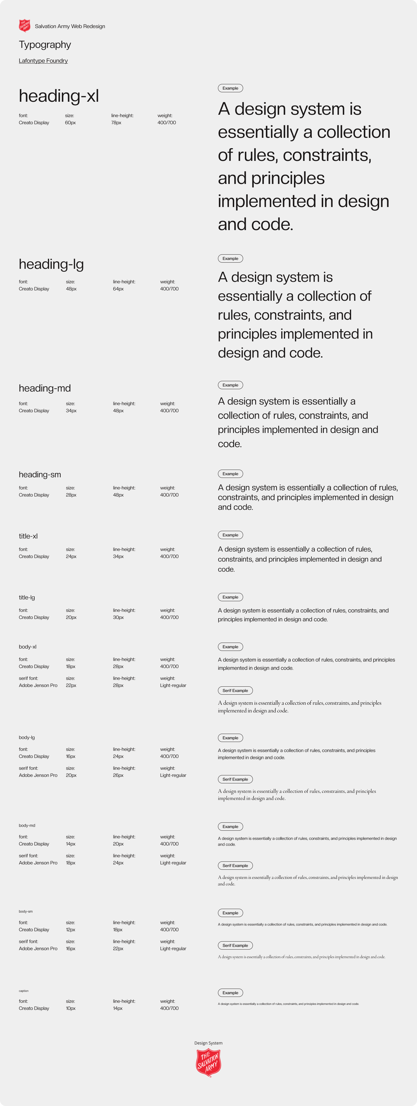
Revamp the old website to make it easier for users to seek assistance, while keeping the spirit of a legacy brand. The fantastic longterm relationship started slowly with enough time to make a web style guide – and then the style system was put to the test. Timelines moved, and with a design team of three, we had the tremendous task of finishing all the pages of the site in less than a month to get it out in time. The modular design made the impossible happened. Ask to see my file, and you'll want me on your team.
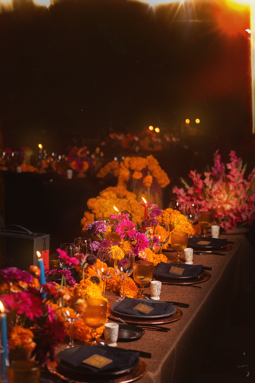
We called the directions after traits that mattered to the Salvation Army: Faith and Humble. Faith tackles large, heartwarming imagery with a strong graphic style. It prioritizes storytelling to tell the audience how they can make an impact – by enveloping them in the world of grace that we have for them, they can rest knowing we value every story. Would require upkeep on the National site, but would make the experience special and memorable. Humble is straightforward and people friendly– It acts like a hub where Salvation Army can keep people up to date and at their service.
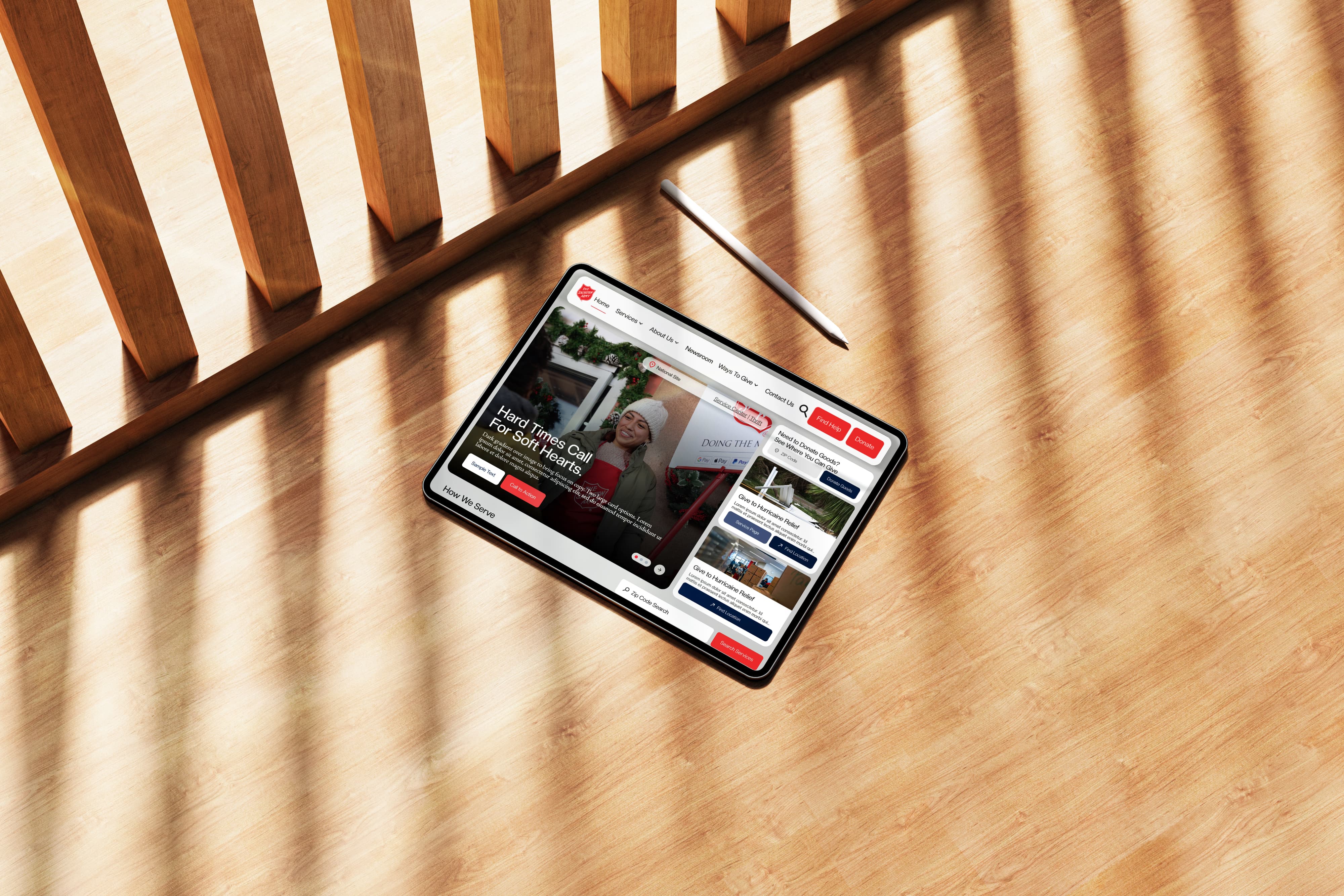
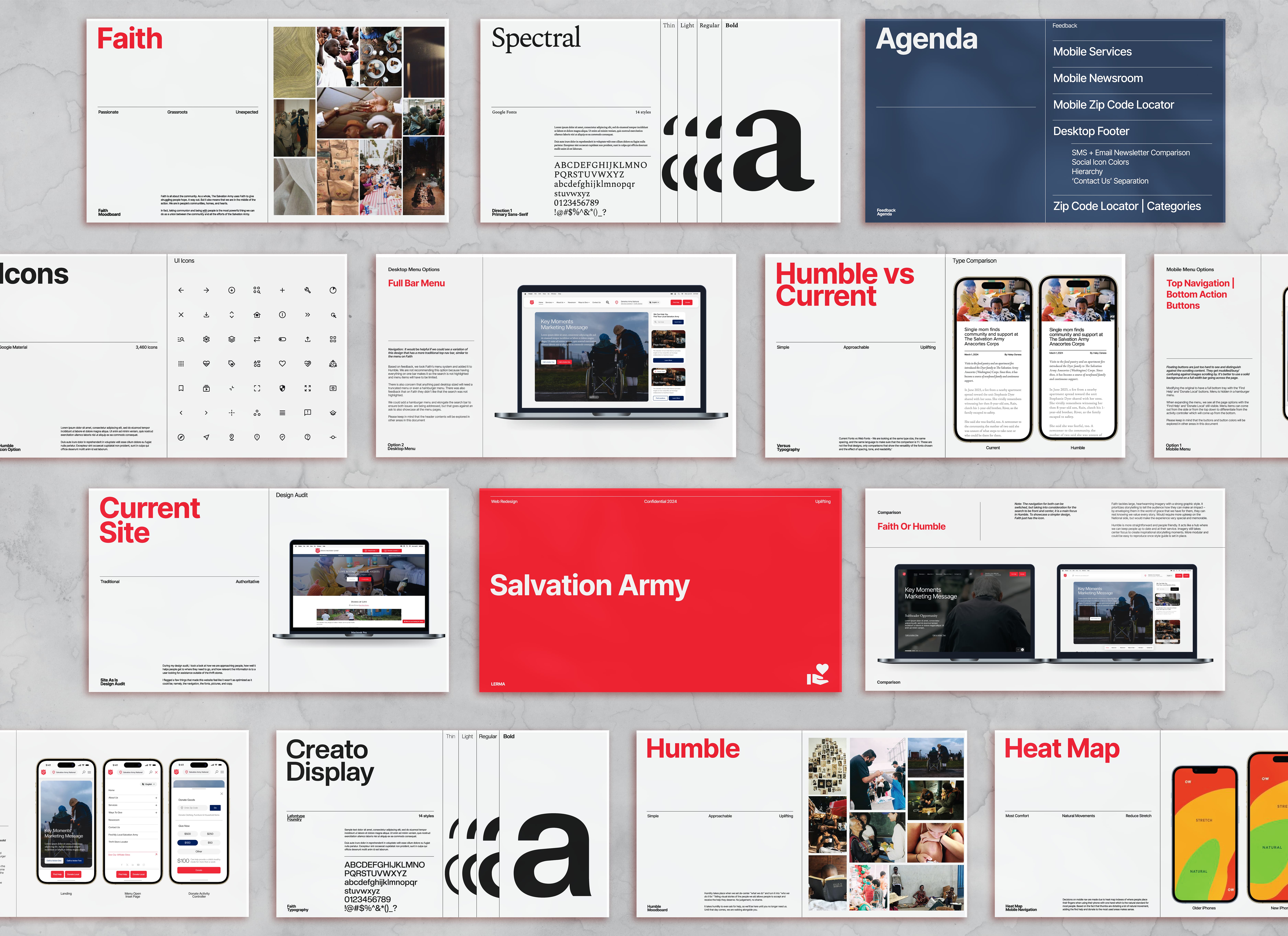
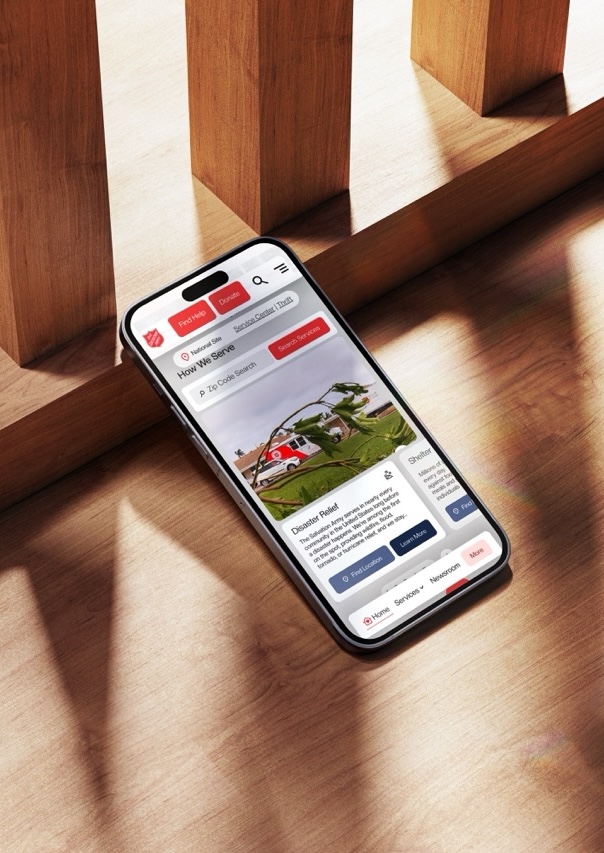
Ultimately, Humble came out on top due to the modular design that would make it easy for their territories to customize – and for us to design within a structured design system. Humility takes place when we set out to de-center ”what we do” and turn it into “who we do it for.” Telling visual stories of the people we aid allows people to accept and receive the help they deserve. No judgement, no shame. It takes humility to even ask for help, so we’ll be here until you no longer need us. Until that day comes, we are walking alongside you.