design@andyvera.com
+1 (214) 995-2185
Andy Vera © 2026


menu
close


Woven fabrics are an expression of a community’s history, values, traditions, and identity—rich in symbolism, colors, and unique motifs—they foster a curiosity, understanding, and appreciation for the diversity of all people and their cultures
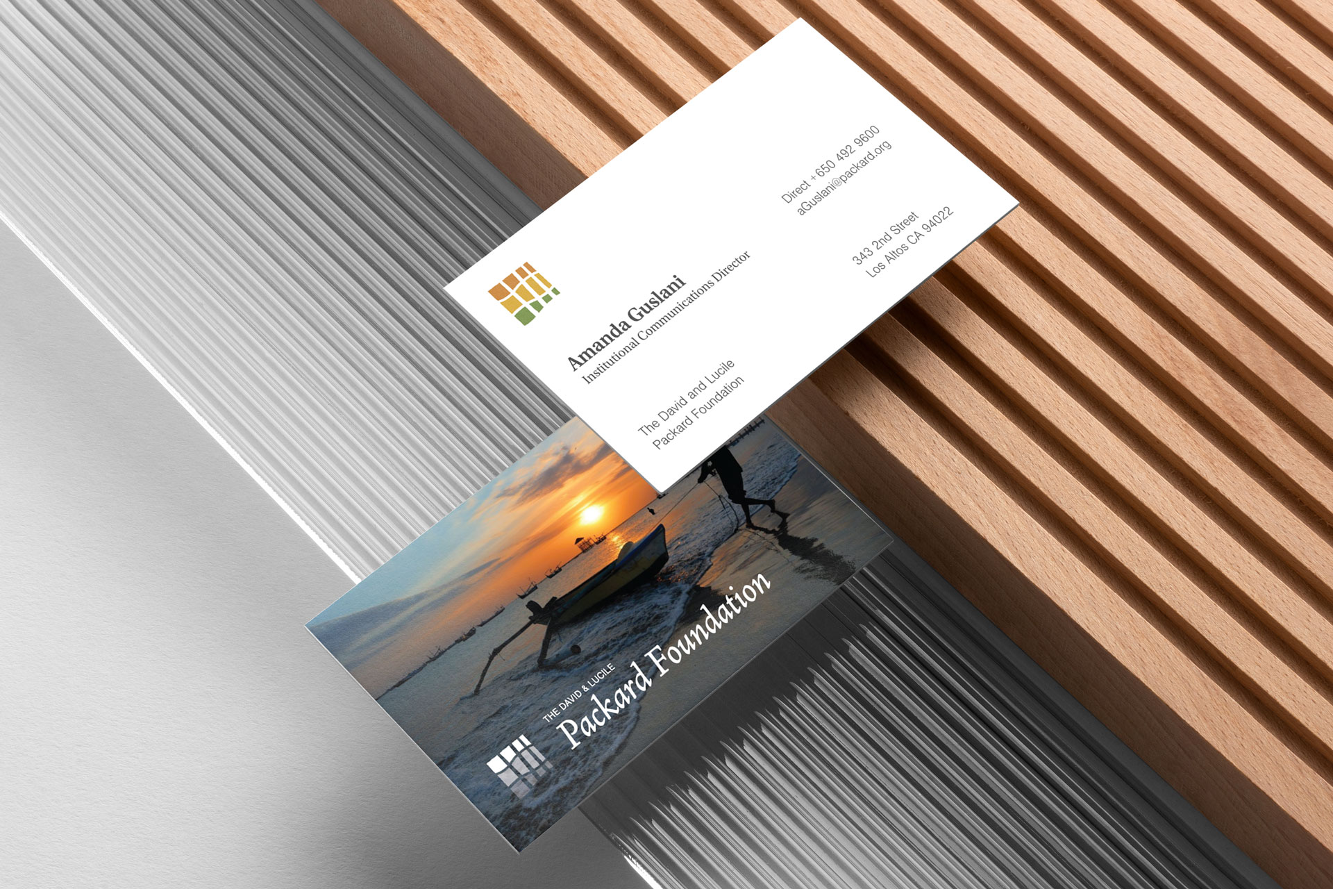
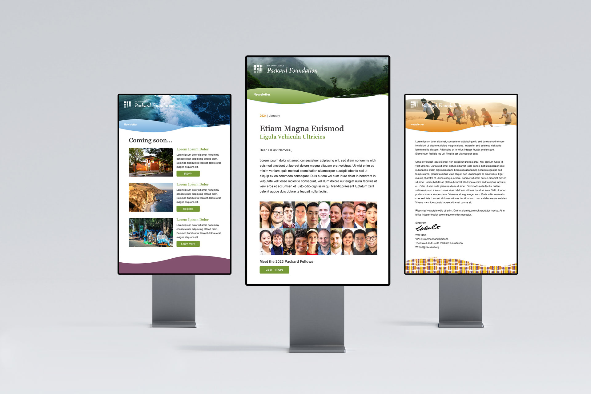
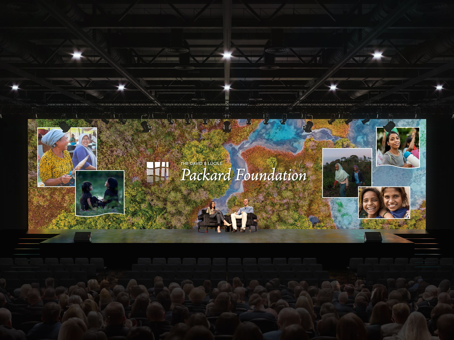
Since 1964, the David and Lucile Packard Foundation has been supporting philanthropic efforts in support of their vision for a just and equitable world where both people and nature flourish. Alongside BarrettoCo, we partnered with key stakeholders and decision-makers in the development of a modernized logo mark, a new brand mark, proof of concept in the form of a design system, and the creation of identity guidelines.
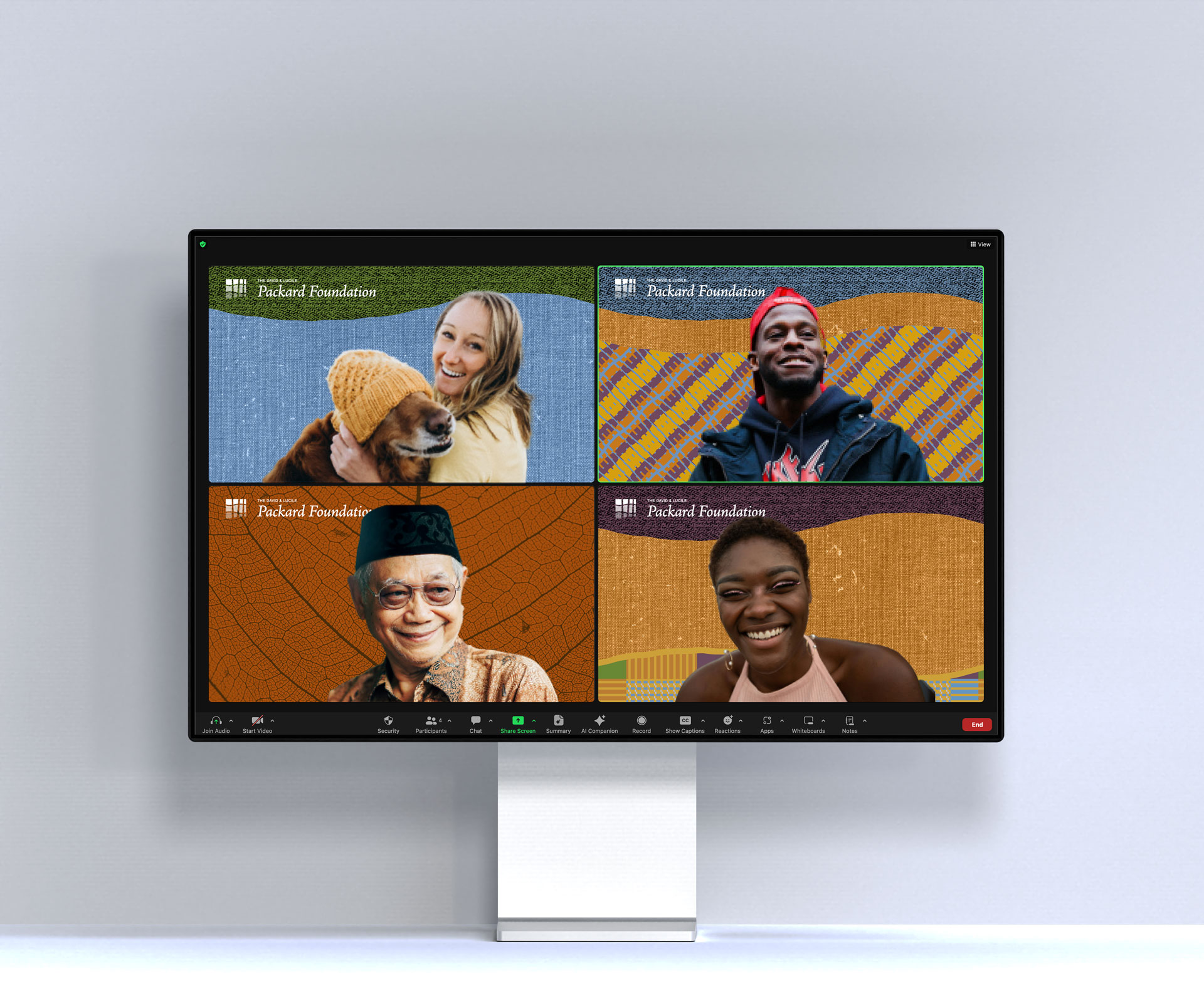
Exploring “interwoven” as our concept, our studies included forest tree trunks interlaced with ocean waves. Each distinct, intricately intertwined strand enhances the resilience, longevity, beauty, and solidity of the outcome—the fabric. Woven fabrics are an expression of a community’s history, values, traditions, and identity—rich in symbolism, colors, and unique motifs—they foster a curiosity, understanding, and appreciation for the diversity of all people and their cultures. A visit to headquarters and the family home, now a grantee meeting space, revealed a carefully curated design aesthetic with deliberate intentionality. Inspired by both environments, we developed the concept of a “weave”—a metaphor for interconnected ideas and efforts. Our goal was to authentically represent the foundation’s DNA with a new, refreshed public image. The following overarching themes guided our efforts and design decisions: people/nature; harmony; joy/optimism; West Coast ethos; everlasting; between where we are now and net-new; great design: make it artful; nature is beautiful; and lastly, it must be legible.